Drypoint
|
Title: MAM Advertisement
Size: (30.48cm x 30.48cm) x 3 Medium: Drypoint Etching and Watercolor Completion: March 2024 |

|
Exhibition Text
This triptych of prints is meant to function as an advertisement for the Milwaukee Art Museum. I created the prints by roughly outlining found images of the museum for the internet that best represented it and its environment. With these prints, I wanted to explore the relationship between color and lines and how they create and add purpose to a poster. Also, exploring the relationship between how people view a location, and how the location can create a different environment within.
Inspiration

Moulin Rouge: La Goulue
By Henri de Toulouse-Lautrec
|

Divan Japonais
By Henri de Toulouse-Lautrec
|

Henri de Toulouse-Lautrec was a French artist who focused mainly on capturing the Parisian’s nightlife. He depicted the environment he observed and experienced in art. He created both paintings and posters. However, he is
most famous for his posters. He also wanted to depict popular entertainers in his art of Parisian nightlife. His posters were used for advertisements. One of his
most famous posters is the “Moulin Rouge, La Goulue” poster from 1891; this poster portrays the Moulin Rouge dance hall. He created several art pieces based
around the Moulin Rouge, mostly paintings. Toulouse-Lautrec’s process of creating his posters involved creating sketches; these sketches could end
up being as big as the final poster. Then, he would transfer the sketch using brushes and crayons onto the lithographic stone. (A lithographic stone used in the Lithography, this art medium is used to make posters). In his work, Toulouse-Lautrec often covered up the legs of the figures; it is speculated that his condition affected his bones. However, this didn’t stop him from creating beautiful pieces full of rhythm and movement. While the legs of the figure were often covered up, his technique of line work created an essence of movement. The techniques he used for his posters were unlike most techniques used to draw the outline of a figure; instead of focusing on the complete anatomical structure of the human figure, Toulouse-Lautrec focused on line movement and color. His line work consisted of free-flowing lines; the free-flowing lines enhanced the movement of the figures. He added typical solid colors onto the figure to fill in the outlined areas of the figures, foreground, and background. But Toulouse-Lautrec used a technique called “Crashis,” where ink is splattered onto the lithographic stone; this creates mists of color.
Toulouse-Lautrec created his art during the art movements of Post-Impressionism and Art Nouveau. Post-Impressionism characteristics included and focused on symbolism, scenes from everyday life, distinct brushstrokes, and a more artificial color palette instead of a realistic color palette. Art Nouveau characteristics included organic lines and contours, soft, muted colors, ornamentation, and asymmetry.
After viewing many of Toulouse-Lautrec’s posters, I was impressed by the fluidity between the lines and how these free-handled lines create such an emphasis on movement. His posters’ emphasis on line movement created a sense of rhythm. I realized I had this reaction to his style of work because not all artists at the time were creating figures in the free-flowing style, and creating a free-flowing figure that accurately depicts the environment was not an easy skill. As a viewer, my eye is immediately drawn to the emphasized figure of the posters; they can be emphasized by size, color, placement, or event from the movement that guides my eye toward the figure. His works have inspired me to try his technique of loose-flowing lines and subtle color to fill a certain area.
Planning
I knew from the beginning I wanted this project to be an advertisement for a popular place in my local area, similar to how Toulouse-Lautrec advertised popular areas in his region. Already having knowledge on popular location in my area and doing further research, I ended up decided to make an advertisement for the Milwaukee Public Art Museum (MAM). Because I am planning on making an advertisement for a popular location based on what it exhibits and not entertainers and people, I wanted to capture the different environments that MAM exposes the people too. To capture the different environments I decided on doing a triptych advertisement.

Figure 1
|
Right away I knew one of the prints for the triptych for the advertisement should be a print of the outside of the MAM. Because MAM's outer architectural design is one of Milwaukee's famous symbols, the architectural form is not only visually interesting, but the outer wings also move again making it more popular. I wanted to make a accurate representation of the outside of the MAM, so I found it best to find an image of the outside of the MAM. (Figure 3).
|
|
For the second print of the triptych, I wanted to showcase the modern and sleek interior of the MAM when people would first walk in. I researched to find what I thought to be the best interior photo for my print. (Figure 2).
For the last print, I wanted to emphasize a whole new environment within the MAM. I wanted to stray away from the basic white and blue colors, to emphasize the art within the MAM. Thinking about the times I have visited MAM I remembered the area of the museum that was dedicated to all historical paintings, sculptures, and other ancient artistic artifacts, seen in the Ancient Mediterranean section. I finally found the image I felt would be a great contrast to the other images, but still represent the MAM. (Figure 3). Figure 3 contrasts with the variety of colors and actual displays of art. Once I found all my images on which to base my prints, I knew I would have to add text to make the function of these prints more like advertisements. However, I realized I shouldn't |

Figure 2

Figure 3
|
just add "Milwaukee Art Museum" text to all three prints because it would lack variety and not accurately represent the MAM. I wanted to personalize it to fit what the MAM stands for, so I went to their website to research what texts I should add to the prints to find what would most represent the MAM. Right on the homepage, I saw three words: "Exploration," "Reflection," and "Community." these words I knew would be a better textual fit for the advertisement prints I was going for. With these words I thought I could spread them across the three prints I would make. ultimately I decided that the first print would be based on figure 1 and I would use those words but rather just write "Milwaukee Art Museums" and Art Exhibitions, as I felt that was an appropriate way to interduce the MAM.
Process

Figure 4
|

Figure 5
|
The first step to creating the prints was making the outline of where I wanted to carve. To create the images I did a rough outline of the found images I compiled above (figures 1,2,3).
I used the grid method to replicate the shapes of the original image, to create the grid I used an app called Procreate on my iPad, and uploaded the photo (see figure 4). I used a grid tool and adjusted the size of the grid until I was satisfied the sizing. I then replicated the grid into my sketchbook on a outline of the size plate I was going to be carving the design into later. (see figure 5). |
|
When I finished outlining and drawing in detail what I felt was important to the environment of the MAM, I then sketched in the texts. For the first print of the triptych, I wanted it to be an "introduction" print of the MAM, so I wrote out "MILWAUKEE ART MUSEUM" and "ART EXHIBITIONS." I chose to write art exhibitions because MAM is a museum that displays art exhibits. (Figure 6)
For the second print, the environment is shown as relaxing by the cool colors of white, grey, and blue |

Figure 6
|

Figure 7
|
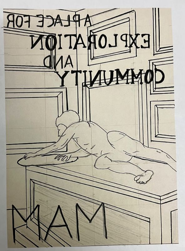
Figure 8
|
and the smooth interior texture. Considering the sayings I found on the MAM website, I decided using "A PLACE FOR REFLECTION" would fit best because of the state of the environment.(Figure 7). For the last print, I then had to leave the sayings that I found on the MAM website, "A PLACE FOR EXPLORATION AND COMMUNITY." I thought the amount of text would be a good balance with the more busy environment of all the art in the background. (Figure 8).

|
When all the outlines were done for the prints, I needed to transfer my design onto the plastic plates. First, I had to peel a protective film off the plates, and then I lined up the edges of the plate with the rectangular outline on my designs. When lined up, I used blue tape to secure them in place. I could start carving when all plates were secularly attached to the paper. I used a sharp dual-ended metal etching tool to carve out the lines on the plastic plate.
|
|
I started carving what would be print 1, first I carved out the text at the top of the print. All I did was carve one straight line tracing the letters below the plate. (Figure 9). I repeated the same method of carving the outlines of my designs if they were straight, solid, and or thin lines. (Figure 10). |

Figure 9
|

Figure 10
|

Figure 11
|

Figure 12
|
However, I had to change how I carved my design into the plate when I got to the thicker text. The carving methods used to create the appearance of a more solid section of a print, is by cross hatching, and hatching into the plate. I lead more towards hatching, but sometimes resorted to cross hatching if I felt just hatching was covering enough space. (figures 11 and 12).
|
I repeated both methods of carving for thinner lines, and thicker lines for all three prints.
When all the prints were done being carved, I then moved on to printing the designs. I first had to take precautions to protect myself and the things around me, so I put on gloves and covered the surfaces I would be using in newsprint. Taking these precautionary steps not only protects the surroundings but also would lessen the chance of ruining one of the prints.
|
The first step was to cover the plate in ink; I used an oil-based ink, a palette knife to transfer the ink onto the plate, and a squeegee to spread the ink across the plate evenly (Figure 14). Once the ink was evenly spread, I had to start the plate. I ripped newsprint strips and crumpled them into texture balls to do this. (Right side of Figure 15). The ball's texture helps remove the thickest part of the ink layer and remove some of the ink, taking the carved spots (Figures 16 and 17). Then, the newsprint ball was filled with ink, or I removed most of the ink; I then went in with a flat piece of newsprint (On the left side of Figure 15) to help remove the access ink from the plate. (Figure 18). I repeated this process for all three prints multiple times.
|

Figure 13

Figure 17
|

Figure 14

Figure 18
|


|
When a plate was done being inked I could then print it. Before inking and printing I had to prepare the paper a certain way. I filled a big container with water and placed my watercolor paper in one at a time making sure to submerge the paper in the water. I then let the paper soak in the water for approximately 8 minutes. When the 8 minutes passed I took the papers out one at a time and laid them flat on a cloth, and using another cloth patted the paper so it was damp.
|
|
After patting all the papers to a damp state, I moved one sheet of paper to the press (Figure 19) so it was ready to place a plate on when I was done inking it. When I was done inking a plate, I would bring it over to the press, fill the center of the paper, and lay the plate gently down, ink with the down on the paper. (Figure 20) When the print was laid down on the paper, I flipped the felt back over the paper and turned the crank until the print and paper were on the other side. I lifted the felt and gently lifted the plate to reveal the print. I repeated this a few dozen times in total. (example of how a print would turn out see in figure 21).
|

Figure 19

Figure 20
|

Figure 21
|

Figure 22
|
After doing multiple prints, I picked my favorite of the three. These three prints would then be painted in watercolor for the final triptych advertisement. The three prints I chose are in Figure 22. I picked these prints because I felt that the lines were dark and had fewer ink smudges than the other prints. |
The final step to completing my prints was to watercolor them. I wanted to try and achieve a smooth wash of watercolor; I attempted this by adding a lot of water to the watercolor and then adding more to my brush. Then, on the paper, I made quick, big strokes to dry and minimize the texture of the water, or in smaller areas, I would use a thin, longer brush with more water to spread the color evenly. I repeated this for all prints until I was satisfied with he outcome of the prints.

Print 1
|

Print 2
|

Print 3
|
Experimentation

Figure 23
|

Figure 24
|
I found the ink too faint with my first few prints and a little smudgy. I wasn’t sure what the cause of the faint ink was or the smudged ink. Because the paper wasn’t too wet, and the amount of ink was just right.(Figure 23). So, I adjusted the gauge to increase the pressure on the plate. I found that changing the gauge did help with the appearance of the ink. However, I still noticed smudging, so I tried using the texture ball to remove more ink from the crevices. Then, I would go in with the flat piece of paper to take away more ink. (Figure 24)
|
|
I noticed less smudging with the prints but saw the lines were more faint (Figure 25). So, I tried removing less ink with the texture ball and more ink with the flat piece of paper. I found this to work much better, limiting the smudges of ink but still keeping a great appearance of the ink. Through the trial and error of printing, I found that using the texture ball of paper to remove ink removed it from the plate surface and the ink from the crevices. While using the smooth piece of paper, removing the ink from the plate surface and the extra overflowing ink from the crevices would make it less smudged. (Figure 26)
|

Figure 25
|

Figure 26
|

Figure 27
|
Another thing I had to experiment with was watercolor. While I have used watercolor before, I have never used it over oil ink. I was curious to know how the watercolor and oil ink would interact, so I did some test washes on a messed-up print. Using a light color was the best way to see how the ink would react to watercolor(figure27). So, I used yellow, thinned it with more water, and started painting over the wing on the print. At first, I didn't notice much difference in the line work on print; I initially thought the ink would smudge. Then, I swatched the watercolor that was left on my brush from painting over the wing and compared it to a fresh swatch of the yellow watercolor. Right away, I noticed a slight change in the yellow's opaqueness and tone. It changed from bright and solid to muted and transparent (Figure 28). I wanted to test further to see if this change would be the same for other colors. So, I tested the colors blue and red. While I did see a visible change in the intensity of the brightness of the colors shift to more muted (Figures 29 nd 30), it wasn't as big of a change as the yellow had.
|


Critique
|
|

Moulin Rouge: La Goulue
and Divan Japonais
By Henri de Toulouse-Lautrec
|
My advertisements and Toulouse-Lautrec's advertisements are similar in that both were created using a printing method. Still, the difference is the printing method used to create the poster. The printing method used to make my posters is called Drypoint. Drypoint Etching is where an image is etched into a plate using a sharp tool. Ink is then added to the plate and wiped away until only ink in the crevices is left. While the printing method Toulouse-Lautrec used to create his posters was a method called lithography. Lithography is where a design is drawn onto a flat surface such as stone or metal, and the ink is then secured using a chemical and printed onto the paper. Aside from the method used to construct the posters, both Toulouse-Lautrec and I used the art element of lines throughout the posters. The lines are used in both works to separate the color, show the outline of figures and shapes, and emphasize detail on the subject. Additionally, both use color in a fair sense; there is no depth in the color from shading or highlights. It is a fair wash because its lines and details give the subjects and environment a layer of depth. Another difference is the subject matter of the advertisements; in Toulous-Lautrec posters, while sometimes he may be advertising for an entertainment spot or entertainers, he uses people as the subject matter. For my advertisements, my subject matter was the environments within the MAM; since the MAM is based around people, it is based around objects. Focusing on architecture and objects more fitting than people. A different relationship dynamic is presented in Toulouse-Lautrec's posters than mine. In Toulouse-Lautrec's posters, the relationship between the characters shows action and interactiveness, portraying a busy environment. My posters do not represent a relationship among people but a relationship with how people react to the environment and objects around them. Lastly, both posters have the same purpose: to advertise something popular.
Reflection
After completing this project, I started acquiring the skills for drypoint etching. While working on creating the prints, if a print did not come out how I wanted, I had to remind myself that this was my first time doing this medium of printing. I have done another medium of printing before, block printing, which is similar because both involve carving, but the drypoint is reversed.
My inspiration connects to the function of my prints, which are used for advertising purposes. It also connects because Toulouse-Lautrec was known for his artistic style and color use. I wanted to explore the relationship between lines and color in this piece and what it can portray with less depth. Additionally, I wanted to make this piece express my relationship with a popular spot in my city that I have visited many times. I also wanted to express how people interact and view the MAM.
I encounter quite a few challenges throughout this process. The first challenge was the carving; I found it difficult to carve my design onto the plate, especially around the curved parts. However, I learned to go slow and turn my plate while carving to avoid unwanted crevices. Secondly, I found the printing process challenging as well; removing the ink took longer than I thought it would, and after running the plate through the printing press, I was often unhappy with the results because of either faint lines or smudging. I took many trials to get just one good print of my designs. My final challenge was the watercolor; I thought getting a flat layer of watercolor on the paper would be easy. However, I was wrong; getting a flat wash in the smaller, more detailed areas was especially hard. I overcame this by adding more water to the paper to help spread the watercolor more easily.
My favorite part of this project was the printing, even though it was a challenge because the outcome wasn't always the desired goal. I found the process very satisfying and fun, more fun than anticipated. Ultimately, this is my first time using this medium. I enjoyed it and want to do more projects using it or similar mediums. I hope that viewers see my work and think they try new mediums and methods they haven't done before because they may end up liking it, even if it is challenging.
ACT
- My inspiration was Henri Toulouse-Lautrec and he created artistic advertainment posters for popular spots in Paris, France, I also wanted to create a artistic advertainment for a popular spot where I live and have grown up around the influence of
- Toulouse-Lautrec's approach to creating his poster was to add a new style and break the standard style for poster making in the advertising world
- Added a new style or spin on a common medium or process to achieve a goal often grabs peoples attention
- The central idea around my research was a "simplistic" artistic design with limited color and use of lines to advertise popular areas
- Making advertisements can't be based on one perspective and needs to include what the business stands for; however, advertisements can portray the same message in different styles.
Bibliography
Alan Curtis Birnholz. “Henri de Toulouse-Lautrec | Biography, Artwork, & Facts.” Encyclopædia Britannica, 5 Feb. 2019, www.britannica.com/biography/Henri-de-Toulouse-Lautrec.
Figure 2 - backyarddestinations. “An Abundance of Amazing Art at Milwaukee Art Museum.” Backyard Destinations, 9 Nov. 2016, backyard-destinations.com/milwaukee-art-museum/. Accessed 26 Mar. 2024.
Michael, Authors: Cora. “Henri de Toulouse-Lautrec (1864–1901) | Essay | the Metropolitan Museum of Art | Heilbrunn Timeline of Art History.” The Met’s Heilbrunn Timeline of Art History, www.metmuseum.org/toah/hd/laut/hd_laut.htm#:~:text=The%20artist%20frequently%20employed%20the.
Figures 1 and 3 - Wikipedia Contributors. “Milwaukee Art Museum.” Wikipedia, Wikimedia Foundation, 29 June 2019, en.wikipedia.org/wiki/Milwaukee_Art_Museum.
