Illustration
|
Title: Nature or Technology?
Size: (22.86cm x 31.1cm) x2 Medium: Acrylic Paint on Illustration Boards Completion: November 2023 |
|

|
Exhibition Text
My illustration “Nature or Technology?” intended to depict how technology can impact relationships by separating and distracting us from what and who is around us. In the nature version, I wanted to show interaction and focus on one another and how nature brings happier emotions and keeps us together. My illustration was inspired by personal reflection on how technology influenced my life and others around me, and the look and positioning of Toulouse Lautrec and Claude Monet inspired the subjects.
Inspiration

|

Moulin Rouge: La Goulue
By Henri de Toulouse-Lautrec |

Camille Monet and a Child in the Artist's Garden at Argentuil
By Claude Monet |
\My illustration piece “Nature or Technology?” was inspired by “Camille Monet and a Child in the Artists Garden at Argenteuil” By Claude Monet and the style of Henri de Toulouse-Lautrec posters. One thing that both these artists have in common is they both did work with impressionism. Firstly, Claude Monet was an impressionist artist. He created “Camille Monet and a Child in the Artist’s Garden at Argenteuil” in 1875. He made this painting along with other paintings in a series while he and his family were staying in Argenteuil, and this series of paintings included his wife in the gardens. Some characteristics that are seen in this painting are long and short loose brushstrokes and made up of rich color. The lines add significant amounts of form and texture to the painting. The rich color also makes certain aspects of the painting pop out, such as the flowers in the background and the faces of the subjects. From this painting by Claude Monet, I was really inspired by the nature aspect, with the mother and child as the main subjects. I was also inspired by the mother and child’s body language and positioning. It showed two people interacting with each other in a caring way. I thought this would greatly inspire my piece to better emphasize relationships. I was also integrated by how busy the painting looked; the objects moved my eye to every aspect of the painting. Moving on to Toulouse-Lautrec, he was a post-impressionism artist. He was known for his paintings and posters. For my illustration, I was inspired by his posters. He created his posters for advertisement purposes, and an example of one of his posters is the “Moulin Rouge: La Goulue,” as seen above. This poster was specifically meant to advertise the performance of the dance. I was inspired by the overall style of the poster. I wanted to include the simplistic style of the characters because he did a great job portraying the meaning of the poster through simplistic subjects with vague detailing in his posters. I was also inspired by the colors because, unlike Claude Monet, Toulouse-Lautrec used a more muted color palette for his posters. I wanted to incorporate the color palette of Claude Monet and Toulouse-Lautrec because they evoke different feelings. I find the movement intriguing; his posters have the subjects in these dramatic poses. These dramatic poses then help guide the viewer’s eyes in the poster. I think that with the overall simplistic style of the posters, the detail among the subjects and objects in the posters made them stand out more. This is what I wanted in my illustration as well. I wanted my subjects to remain simplistic in design yet have vague detailing to enhance the characteristics of both the subjects and objects.
Planning

|
I knew from the beginning that I wanted to create a piece to illustrate technology and nature’s influence on relationships, specifically with a parent and child, I did make the subjects into a mother and daughter. So, I took the idea of body positioning and language from Claude Monet to emphasize two different relationships between a child and their parent. For my piece’s “nature” aspect (outlined in blue), I wanted to present the Mother and Daughter's as a close and interactive relationship, so I used the positioning of the subjects from Claude Monet’s painting, as seen above. For the “technology” aspect (outlined in red) of the piece, I wanted to show a non-interactive and distant relationship between the Mother and Daughter's. All I did was just turn the subjects opposite to each other to show they were not paying attention to each other or focusing that attention on the technology. |
|
Firstly, I started sketching the “nature” version of the Mother and Daughter’s relationship. As mentioned earlier, I wanted body language to emphasize the type of relationship, so I took the same mini sketch and re-sketched it onto my illustration board. I originally wanted to draw the Mother and daughter wearing dresses. However, the more I thought about it, the easier it was, but I wanted this illustration to be more relatable to present times. So I drew the Mother wearing a skirt and shirt and the daughter wearing a shirt and pants. Referring back to the body positioning, I made sure when drawing the Mother to make her look at her child; since the child, I was drawing was going to be small in size, I made sure to draw the head slightly tilted down, with her legs pointing toward her daughter and her arms reaching out. I also wanted to show the daughter interacting with her Mother, so I drew her facing her Mother while positioning her head tilted slightly upwards so she’s looking up to her Mother. I decided to draw the daughter’s arms reaching out toward the Mother because I wanted to further emphasize the interaction between Mother and daughter. I decided to draw a flower in the Mother’s hand like she would give it to her daughter, who was reaching for it. The flower is important because, in the background, I sketched out a rough area where a bunch of flowers would be. The connection of the flowers and the relationship shows how nature can help create a closer interactive relationship between people. To further illustrate the emphasis of the relationship, I decided a park setting would be the best because it represents how the Mother took her time to bring her daughter to the park to spend time together. To depict a park, I put a fence on both sides of where the flower bush would be and also drew a grass area, as well as a concrete sidewalk. Referring back to the Mother, I wanted to draw her sitting, and I decided to draw her on a wooden bench one might see in a park.
|


|

|
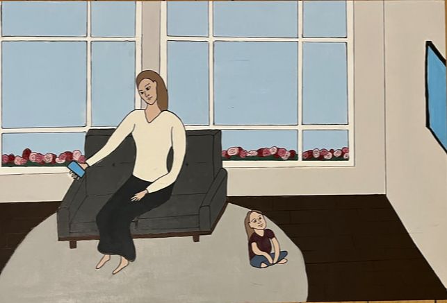
Lastly, I sketched out the “technology” version of the mother and daughter’s relationship. The body language, as mentioned previously, I wanted to be the opposite of the “nature” version. So, I sketched the mother’s body facing the opposite way while looking down at her phone. I originally designed the daughter to play or watch something on a tablet. However, I felt that it would be too small and wouldn’t provide enough emphasis on the technology aspect. I decided to draw the daughter sitting looking upwards at a TV on the wall. I wanted to keep the overall design of this space with the mother and daughter simple so the focus would be on them. Additionally, I wanted to connect the technology and nature aspect. I wanted nature to pop up but not be a part of what the mother and daughter focus on. Specifically, I wanted a minor bit of nature to contrast with the technology. So, I decided to use the empty space within the windows to make a small area of flowers, which would look similar to the ones in the “nature” version.
|
Process


|
My first step to start my illustration was transferring both sketches to their boards. Before doing this, I cut out both my sketches from pieces of paper to fit the boards' sizes. Next, using a pencil, I covered the back of both sketches in graphite, then I tapped the sketches to the boards and started to retrace the drawings I made so that the same image would transfer to the board. Once I finished transferring the sketches, I went in and either redrew certain lines or added more detail to certain areas.
|

|

|
I started with painting the “technology” version of the illustration. I decided it would be best to paint the biggest areas first. I first painted the walls in a medium gray color; then I moved on to painting the flooring in a dark brown, then the window frame in white, and then the couch in a dark gray and light gray rug, and finally, painting the light blue sky in the window. I was particular with color choice. I decided that using a more neutral and dull color palette would not only add to the unity of the piece but also emphasize that this is not an interactive relationship.
|

|
|
After finishing the bigger areas, I wanted to focus more on the Mother and daughter. Since the Mother and daughter are inside, I decided to make their skin tone slightly pale to suggest they aren’t going outside or being exposed to nature and natural sunlight. For the clothing of the Mother and daughter, I wanted to keep the same pattern of neutral, dull, and dark colors. For the Mother, I painted her a cream-colored shirt and black/gray skirt; for the daughter, I painted her a dark pink and a dark, muted blue pair of pants.
|

|

|
The final areas I had to paint were the technology pieces and the flowers. I wanted to keep the technological pieces (the phone and TV) simple, yet I also wanted them to add a slight bit of contrast to the room’s color palette. I decided to give the TV and phone a black outline and frame to the screens. But to contrast the rest of the room, I painted the screens in a bright light blue to symbolize blue light. I also wanted to connect this piece to the “nature” illustration. I decided to paint a small line of flowers along the bottom of the window to not only contrast the room’s color palette but also add to the unity and the illustration as a whole. Once everything was done being painted, I went back in with the 0.5 and 1 size micron pens, outlined everything, and gave detail to certain areas.
|
|
Moving onto the “Nature” illustration, I wanted to start with painting the Mother and daughter first. I kept the same colors to contrast the “technology” illustration but made them more vivid. I did this to symbolize a happier relationship because brighter colors represent happiness. For the skin tone, I used a similar color to the “technology” one but made it slightly darker to suggest they have been outside in nature for a while.
|

|


|
I then moved on to painting the big areas, which included the sidewalk, grass, and the sky. I used the same color, blue, for the sky to connect to the illustrations. I kept the grass and sidewalk simple; the grass I made a light bright green, and the sidewalk a light gray. Once those were all painted, I drew out the fence. I drew the fence using micron pens in sizes 0.5 and 1 and a ruler to keep the lines straight. Next, I painted the bench in a lighter brown. Finally, I painted the flower bush. I first painted a rough semicircle of a slightly darker green to contrast with the grass, and over the bush, I painted different shades of pink in little dots and blobs for the flowers. When all was done being painted, I outlined everything again in the micron pens and added detail to the grass, sidewalk, bench, and flowers. I focused on the detail in the flowers because I made rough little squiggly lines in the flowers to give off the flower texture.

|
Lastly, I focused on drawing the faces of both the “nature” and “technology” versions. I wanted to keep the faces simple, similar to Toulouse Lautrec. I first re-sketched the faces of the subjects. Then, when I was happy with them, I decided to outline them in pen; I used a 0.3-micron pen.
|
|

|
Experimentation
|
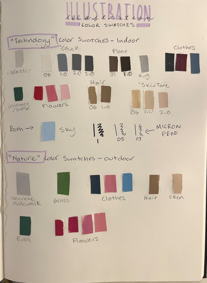
My biggest area of experimenting was with the colors and line thickness. Firstly in the “technology” illustration I knew I wanted the color palette of the room to be neutral and a little more plain. I first mixed a light gray color with a minor bit of brown (Wall), I didn’t want the wall to contrast or to be the emphasis of the room. However I wanted the couch to contrast the wall, to draw more attention to it so the focus would be moved to the mother on the couch. Initially I wanted it to be a cream color (OG), at first when I painted it I felt it was not contrasting the wall enough because they were both light colors. So I decided to paint the couch dark gray. I made three different types of gray 1.0, 2.0, 3.0. 1.0 I didn’t like because I felt the value was too light, with a little too much blue undertones. 2.0 I liked better, but still wasn’t happy with the value, then I added more paynes gray to the mix and created 3.0 which is what I used for the couch. I felt this did a much better job contrasting the wall. Moving onto the floor, again I wanted to contrast the wall, so I a dark brown (OG), however I felt OG wasn’t dark enough, so I then created 1.0 for the floor. I felt like this darker floor color not only contrasted to the wall but made the light gray rug (Rug) stand out more.
|

|

|
Moving on to the subjects (mother and daughter), I wanted to emphasize the mother and daughter staying inside. I did this by creating a slightly pale skin tone. The OG skin tone I felt was too yellow, yet 1.0 I felt was a little too light; I then created 2.0 as the final skin tone. Additionally, I created a darker hair color to subtly suggest they weren’t going outside in the natural light. OG hair color was too light, so I darkened it with some burnt ombre and created 1.0 for the hair. On the other hand, for the “Nature” illustration, I wanted to subtly emphasize the opposite; I wanted to subtly show they are outside and spend time outdoors. I did this by slightly darkening the skin tone and lighting the hair because hair gets lighter in the sun. Moving onto the clothes, I didn’t experiment much with the colors, but I knew I wanted the “Technology” and “Nature” illustrations to have the same clothing colors but different shades. I wanted different shades to evoke other emotions; dark represents detachment and unhappiness, while lighter colors represent happiness and playfulness.
|

|
I struggled to keep the painting area within the lines I drew out. As I was painting, I was smudging away the lines I drew out, making it difficult to know when to stop. My solution was to outline the lines using the micron pens, and I decided to start with the size 05. Once I did that, I found navigating the painting with the colors a lot easier. I also found some lines too thin after the outlines, so I went in with the size 1 to thicken the lines. Lastly, some areas were too basic in design to add more texture. I used the size 03 pen and added subtly lines, dots, and other little shapes as needed. (an example can be seen in this image, which added details to the flowers).
|
Critique
|
|

|
|
In terms of the medium of my piece “Nature or Technology?” vs. Toulouse Lautrec’s “Moulin Rouge: La Goulue” and Claude Monet’s “Camille Monet and a Child in the Artist’s Garden at Argenteuil” are different. I used acrylic paint on an illustration board, a very different medium from Toulouse Lautrec and Claude Monet pieces I found inspiration from. Toulouse Lautrec created his posters using lithography, a form of printmaking, and Claude Monet used oil paints on a canvas. Looking at the movement of my piece, the movement is towards the characters. It’s meant to make the eye move between the characters through their body positioning. This can be seen in the “Nature” illustration because the two subjects’ body positions face each other, so the movement is between the two subjects. This is similar to Claude Monet’s painting, where the mother and child may not be facing each other but are still close together, with the mother’s body turned towards her child. While the movement of my piece may not be similar to Toulouse Lautrec’s piece, they do have the use of lines in common. The lines outline the areas, but they also add detail. My pieces, as well as Toulouse Lautrec’s and Claude Monet’s, have subjects. The “Nature” version of my illustrations shows a similar relationship between the subjects as does Claude Monet’s painting; their body language is similar, and they face each other. Suggestion that they have a good relationship and they acknowledge one another. In contrast, my illustration’s “Technology” version is the opposite because instead of facing each other, they focus on their technology. Because the body positioning is facing the opposite way of each other, this suggests a distance relationship where they coexist in each other’s lives. While it doesn’t share the same body positioning as Claude Monet, it also doesn’t share the same body positioning as the Toulouse Lautrec poster. Again, his posters were made for advertising purposes; while some people are looking at the dancers, they are not interacting with them. In terms of the overall compositions of these artworks, Toulouse Lautrec uses loose lines to give details and outlines, to be filled in with subtle colors and an occasional pop of color. The subtle colors don’t distract the viewer from the line work that creates the form of these subjects and objects in the poster. Claude Monet used bright colors that varied in value and painted these colors onto his canvas using little brushstrokes. When painted together with little brushstrokes, this variation in the value of colors gives an almost blended look; it not only adds texture to the painting but also emphasizes the form of what’s being depicted. My composition takes inspiration from the characteristics of the technique of Line’s work from Toulouse Lautrec with some of the more subtle colors and the bright colors from Claude Monet. While I may use lines to add fine detail and provide an outline for what’s being depicted in my illustrations, I didn’t draw them on as loose and freely as Toulouse Lautrec. I was more harsh with the lines and didn’t make room for much detail, especially with the subjects. While I didn’t do repeated brush strokes like Claude Monet, I did use some bright colors to bring a more lively and happy feeling to the “Nature” illustration.
Reflection
I wouldn’t say my skills have been refined necessarily. But I do think that this piece shows me areas of which I can improve on, even though they are the basics. After completing my illustration and looking at them together as one final piece, it made me realize this piece doesn’t present my technique capabilities, because based on the characteristics I took from my inspiration it appears to be a simple composition. But what I have learned throughout this process is that while a piece's composition may look simple to do, it is easy to mess it up. The mistakes I have made while working in these pieces were very noticeable because there weren't any other detailing factors in my illustration to take the attention away from any of the mistakes I made. An example of a mistake I made was the heads of the subjects, specifically the mother. In the “nature” version the mothers forehead is noticeably bigger, then the mother’s forehead in the “Technology” version. While to one these mistakes are subtle, like mentioned because the composition appears simple these mistakes in proportion are noticeable. Because of that, this led me to realize one way I could better myself as an artist is to work on my drawing techniques. Specifically drawing people, working on the proper proportions for different types of people, working on the shapes used to create the forms for people and positions they are in. Drawing simple outlines of people originally seemed not as hard initially, but this piece made me realize that to draw something simple, it’s best to know how to draw it in a more realistic way first. Because one simple line can make a huge difference in the form of a subject. Overall I wouldn’t do this sort of composition for another one of my future pieces. Because I would want to create a piece that worked on refining my techniques or something that teaches me new techniques to better enhance my skills. Lastly, I don't want the viewers to view my illustration as a bad or basic illustration, but rather a illustration that showcases needed improvement, and attempting to create smooth overall design.
ACT
- My inspiration came from two artists; Claude Monet and his painting “Camille Monet and a Child in the Artist's Garden at Argenteuil”, I was inspired by the characters and their body position, as well as the nature of the piece, Toulouse Lautrec and his posters inspired be style wise, I really liked the composition of the lines and the ways he used colors.
- The Authors I looked into focused on the overall look of their piece, for either advertisement or personal satisfaction
- I have realized I wasn’t going to be able to find artist from historical art movements that can relate their artwork to technology, so insisted I looked into artists style
- I wanted to find artworks that had people interacting and a simplistic essence
- I made inferences with the colors I chose to portray certain emotions all together in the piece.
Bibliography
“Camille Monet and a Child in the Artist’s Garden in Argenteuil.” Collections.mfa.org, collections.mfa.org/objects/34242.
“Henri de Toulouse-Lautrec. Moulin Rouge, La Goulue. 1891 | MoMA.” The Museum of Modern Art, www.moma.org/collection/works/188979.
“Madame Monet and Child, 1875 by Claude Monet.” Www.claude-Monet.com, www.claude-monet.com/madame-monet-and-child.jsp#:~:text=During%20the%201870s%20Monet%20was. Accessed 25 Nov. 2023.
